NFT Innovation
Increasing conversion and engagement through thoughtful and impactful UX|UI
Degenerate Ape Academy, one of the biggest (and coolest) companies in the Web3 space, blew up when they minted their collection of 10,000 NFTs in August 2021. By July 2022, the company had expanded to a point where they needed a Product Designer to help ship a backlog of front-end designs.
The Challenge
In a bear market, could implementing and launching innovative products help increase revenue/raise funds for the company’s operation, while strengthening the community and boost engagement with existing and new users?
My Role
Worked as a Contractor Product Designer alongside the head of Design & Operations, the head of Product, the developers, the CTO, and the Creative Director.
Duration: In a six month period we designed, shipped and iterated on the 3 products described below
Tools: Figma, Adobe Photoshop, Miro, Google Sheets, Google Meet
Auction site
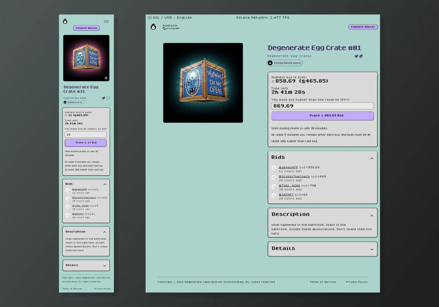
The first challenge was to quickly design and mock, iterate on multiple points of feedback, and work closely with the developerss to build the MVP for a site that would auction rare Egg Crate NFTs (with a 33.3% chance of getting a full Monoliff —DAA artist & Creative Director— custom).
The Brief
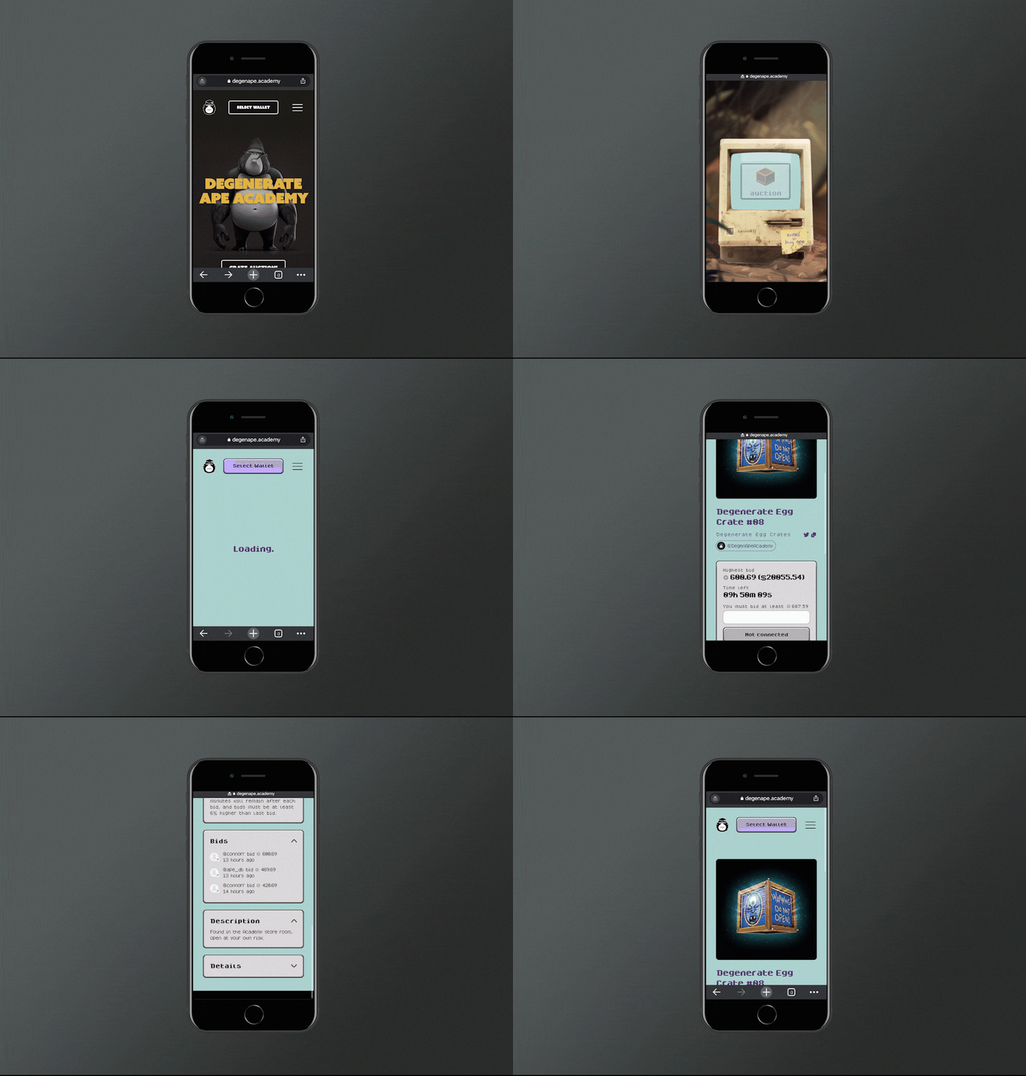
The first approach was to do a quick re-skinning of Exchange Art (platform where the auctions were hosted)’s UI to have it match the brand colors and values for DAA, and access the platform via the Apeintosh* on DAA’s website.
But then, the direction was clarified as: “It’s not just that theApeintosh is the portal to the auction but the auction lives inside the Apeintosh and should be themed as such”.
*The “Apeintosh” was the asset through which users first minted their NFTs in 2021, and it remains as the gateway to “Enroll” (buy an ape) at DAA’s website. A huge piece of the company’s history and lore.
The Design
I then went “into” the Apeintosh’s content and started extracting from it and setting some guidelines on background color, font type and colors, buttons, and fixed text modals.
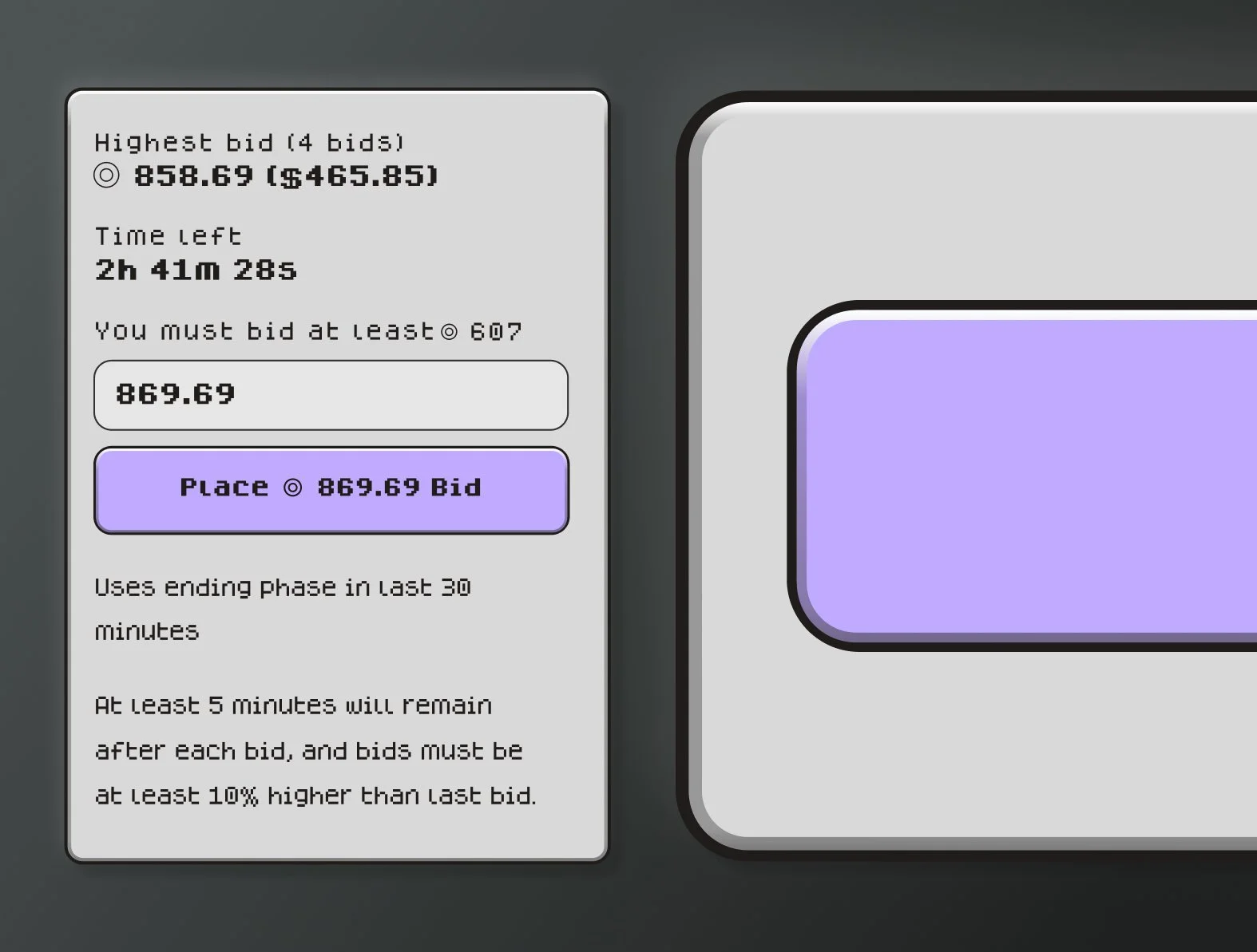
These proved fun when dissecting their “3D” components and replicating them in Figma. There’s a 2-line outline to them: one acts as a stroke, but the inner one has a slight gradient that makes it pop.
Finding a readable pixelated font, and the Figma plugin Pixels were key in this design process.
Opening Flow
As previously established, the Apeintosh is the gateway and home of DAA’s products and features, such as the auction site when it was live and the Enroll function.
In keeping with its retro theme, the flow to boot it was a very important part of the auction entry experience.
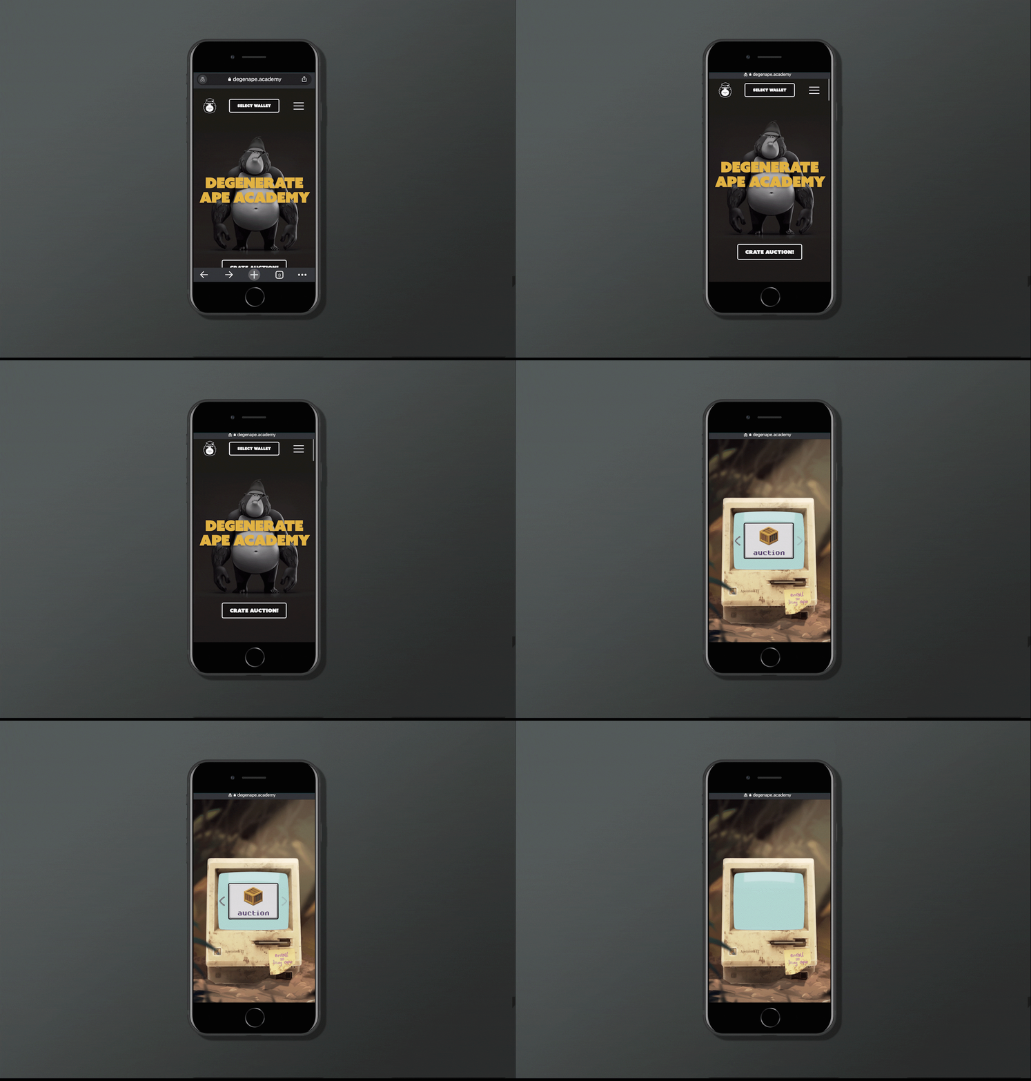
Upon accessing DAA’s website, there were two paths to get to the Apeintosh (entry to the auction site).
By clicking a pulsating (to direct users’ attention to its clickability) CTA button on the main landing page that would then fast-scroll straight to the Apeintosh.
By manually scrolling down to the Apeintosh’s section.
The Auction button itself on the Apeintosh would pulsate as well to denote its affordance. This action was taken as an iteration on previous product launches where users struggled with how to interact with content in the Apeintosh.
The Outcome
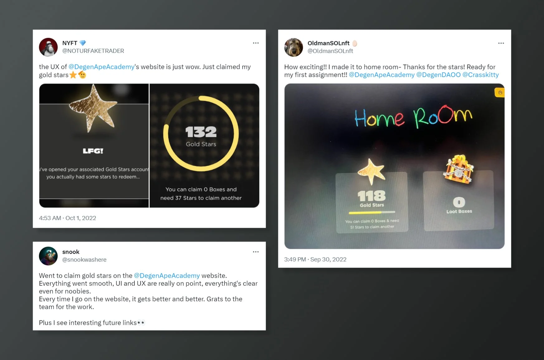
After the launch, users’ reactions on Twitter and Discord were very positive and each bidding war in itself became a very entertaining and engaging event. The constructive response was very encouraging for the entire team.
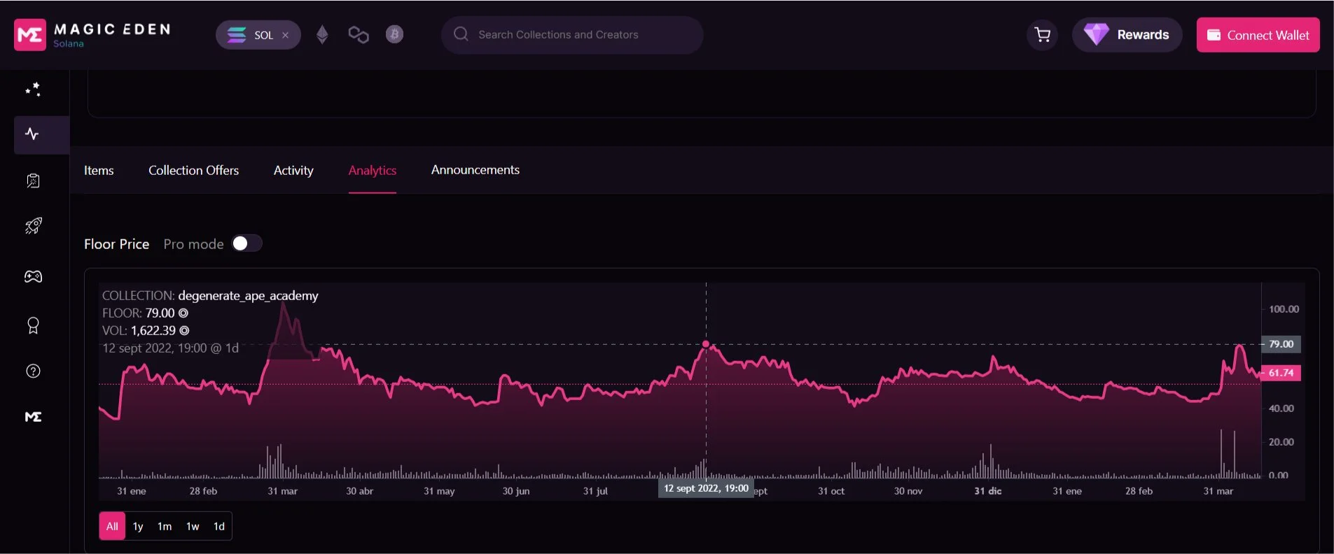
Another big outcome this feature had was positively impacting the NFTs’ floor prices, bumping them to one of their all-time highest (as of May 2023).
Achieving this in the state of the bear market when the auctions happened was a huge deal, as it showed a direct correlation between innovative thinking and the community coming together, responding confidently to a product that would pave the way to more exciting features down the line.
And last, but not least, this collection became Exchange Art’s all time #7 in volume. Over the nine auctions held, a total of $261,723.45 was raised. Again, not too bad for a bear market.
Bonus! Public shoutout from the Co-Founder/Head of Product:
“JP was brought on as our new product designer for this project, & he absolutely killed it. JP had starting designs mocked in the first 24 hours, and then iterated repeatedly based on multiple points of feedback. I cannot stress how delightful it was to work along side him.”
Website Re-design
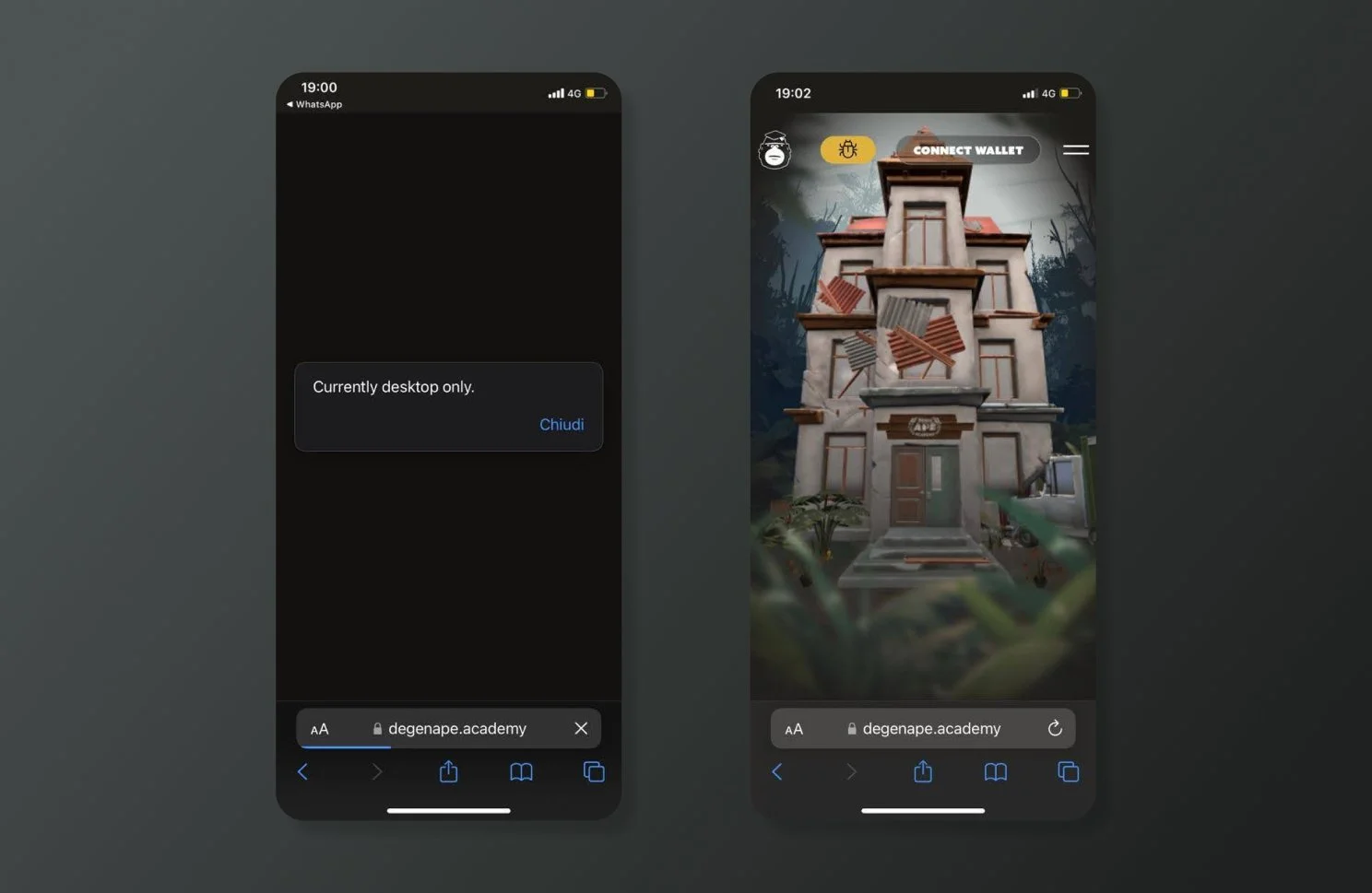
Along with the auction site launch, a website re-design/optimization was carried out. Because many users would access the auction feature through DAA’s website on their mobile devices, it was important for the site to be able to load and take them there.
The Challenge
While incredibly fun and interactive, DAA’s first website proved unable to load on mobile devices. This posed a big limit on the company’s outreach, and called for a mobile-first approach.
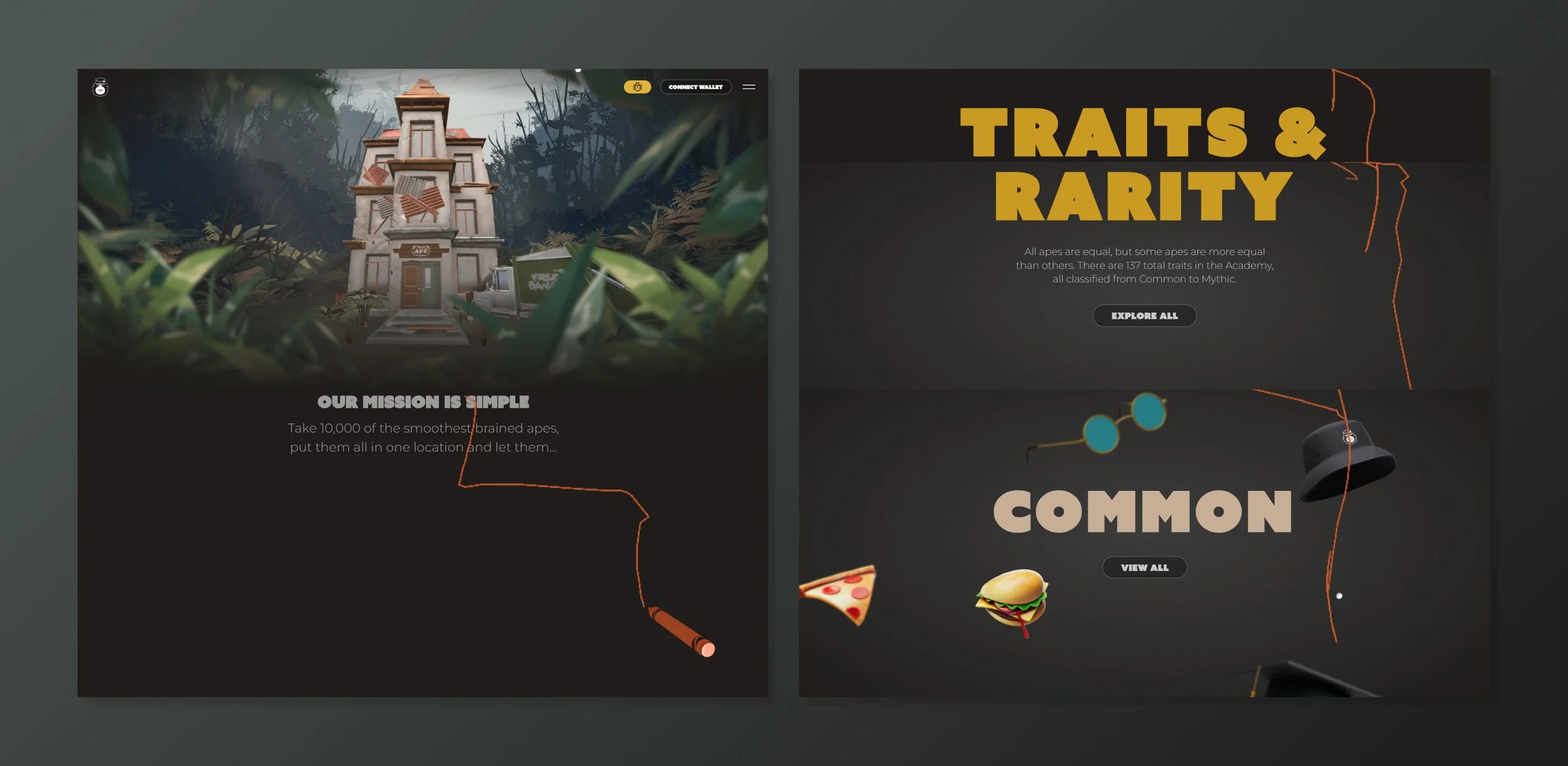
The first website was a thing of beauty. The users’ mouse position on it would leave a trace of crayon, and they could change colors (one for each team member) and have fun drawing while scrolling. The animations made for impactful and memorable statements, and there was a big focus on The Academy itself: a 3d asset where many previous features lived.
In the following link, DAA’s Head of Product shows V1 website and describes its capabilities:
As fond as both the team and the users were of this design, it just wasn’t mobile-friendly, so some optimizing was in order.
The team strategized about what to keep, what to remove, and what to bookmark for future re-implementation. Time was pressing in this matter, given the two features to be accessed through the website (Auction & Home Room, more on that below). So it was agreed upon that there would be as limited animations as possible, and the Academy 3d asset would take a (temporary?) backseat.
Re-Branding
A small but powerful change with this re-design was the use of a new font and colors for the brand text. The new choice has increased visual contrast and impact, while maintaing consistency in tone with the original. It’s a great fit for the innovative direction DAA’s products are going in.
Accesibility
Finally, every color and font used on the website was tested against its placement/backdrop to ensure ADA & WCAG compliance.
Home Room
The third and biggest product I worked on at DAA was Home Room, a reward system hub where users can interactively store and upgrade their NFTs through the earning, recollection, and conversion of Gold Stars: an SFT currency that gamifies the experience of owning NFTs within the Degeniverse.
The Challenge
This being such a ground-breaking feature, we needed increased clarity with users on what it is and how it works.
Several measures were taken to ensure this: Twitter Spaces, a thread and Medium article by the Head of Product, a walkthrough, and an AMA with the entire DAA team (where I designed the hosting platform’s UI to have it match the brand’s colors) to directly interact with users and give out Gold Stars as a part of the Home Room experience.
The Design
For the Home screen, the Academy itself acts as a blurred backdrop, tying up nicely with DAA’s history, as well as providing the perfect background for the theme and content of this product.
Exploration:
Chalkboard imagery and fonts were thoroughly explored before landing on this option
Toolbar menu placement (left vs top)


