Data Management
Simplifying the responsive dashboard experience for a nonprofit
Recent crises (natural or man-made) have evidenced the paramount importance of nonprofits and the work they do to lend a hand in times of need and support various causes. As such, their inner structures and data management softwares need to be efficient, intuitive, and adaptable to allow their volunteers/employees to fully focus on the work at hand and easily manage it and present it to stakeholders and donors.
Project Summary
Airbnb.org was chosen for this project because of the impact of their work, as well as their size and reach. Airbnb.org is a new nonprofit that opens homes in times of crisis. They’re an independent 501(c)(3) that’s supported by the host community, who’ve hosted over 75,000 people—from essential workers on the frontlines of COVID-19, to evacuees from the world’s deadliest natural disasters, since 2012. In the past two years, donors have raised over $1 million USD for these efforts.
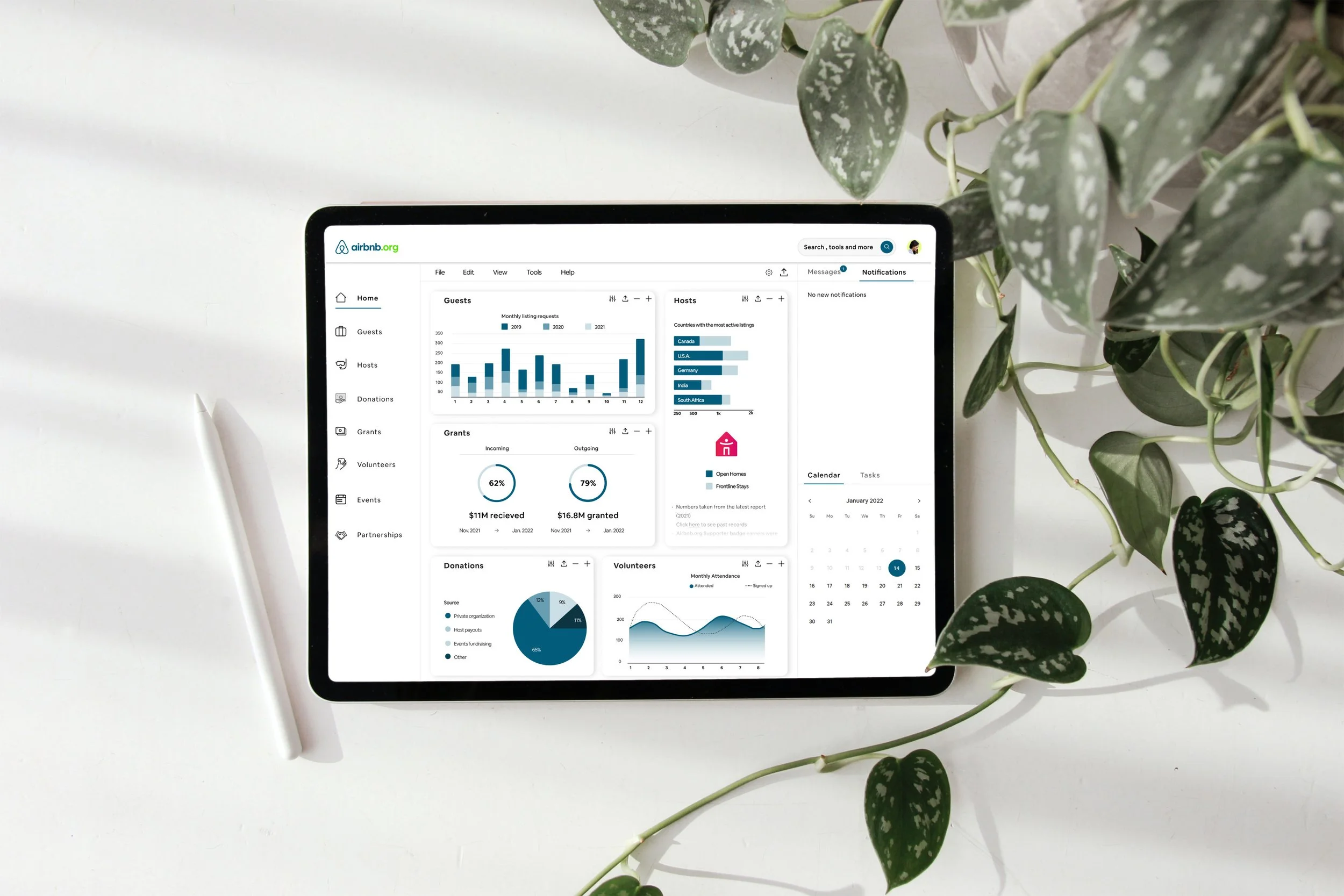
Hypothetically, they would like to design a dashboard that allows them to view information (donations, hosts, etc.) at a glance. They’d like this to be a responsive web design that they can access on desktop and mobile at will.
The Challenge
The two main challenges faced with this project were:
1. The complete lack of familiarity with the subject matter, which meant a more thorough research and immersion had to be made.
2. No engagement with the “client” was made possible, so the User Research had to be done in a way that could closely match the user needs. Some assumptions had to be made and tested.
My Role
User Experience (UX) Designer
Interaction (IxD) Designer
User Interface (UI) Designer
User Researcher
Visual Designer
Duration: 5 weeks
Tools: Figma, Whimsical, Dovetail, Adobe Photoshop, Zoom
User Research
Objectives
Gain insights on users’ preferences and/or processes with dashboards and/or data management
Identify common pain points when using dashboards and/or managing data
Determine users’ “wish list” for dashboard features/look
Understand factors that create a good experience when using a dashboard/managing data online
Assumptions/Risks
Finding participants that specifically meet the brief’s criteria might prove difficult with the project’s time constraints
We assume that by researching users with similar traits or experience (but not Airbnb.org’s platform’s actual users) we’ll gain enough insight to develop an MVP as per the project’s brief
Findings
Competitive Research
By analyzing the strengths and weaknesses of some existing dashboards (with a focus on the ones used by nonprofits), a deeper understanding of how they generally work and are perceived was achieved.
User Persona
Mostly based on interview findings and project goals, the following information outlines the pathway towards the project completion through the user’s needs, goals, motivations, pain points and frustrations.
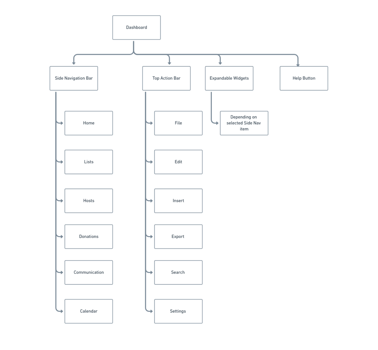
Sitemap
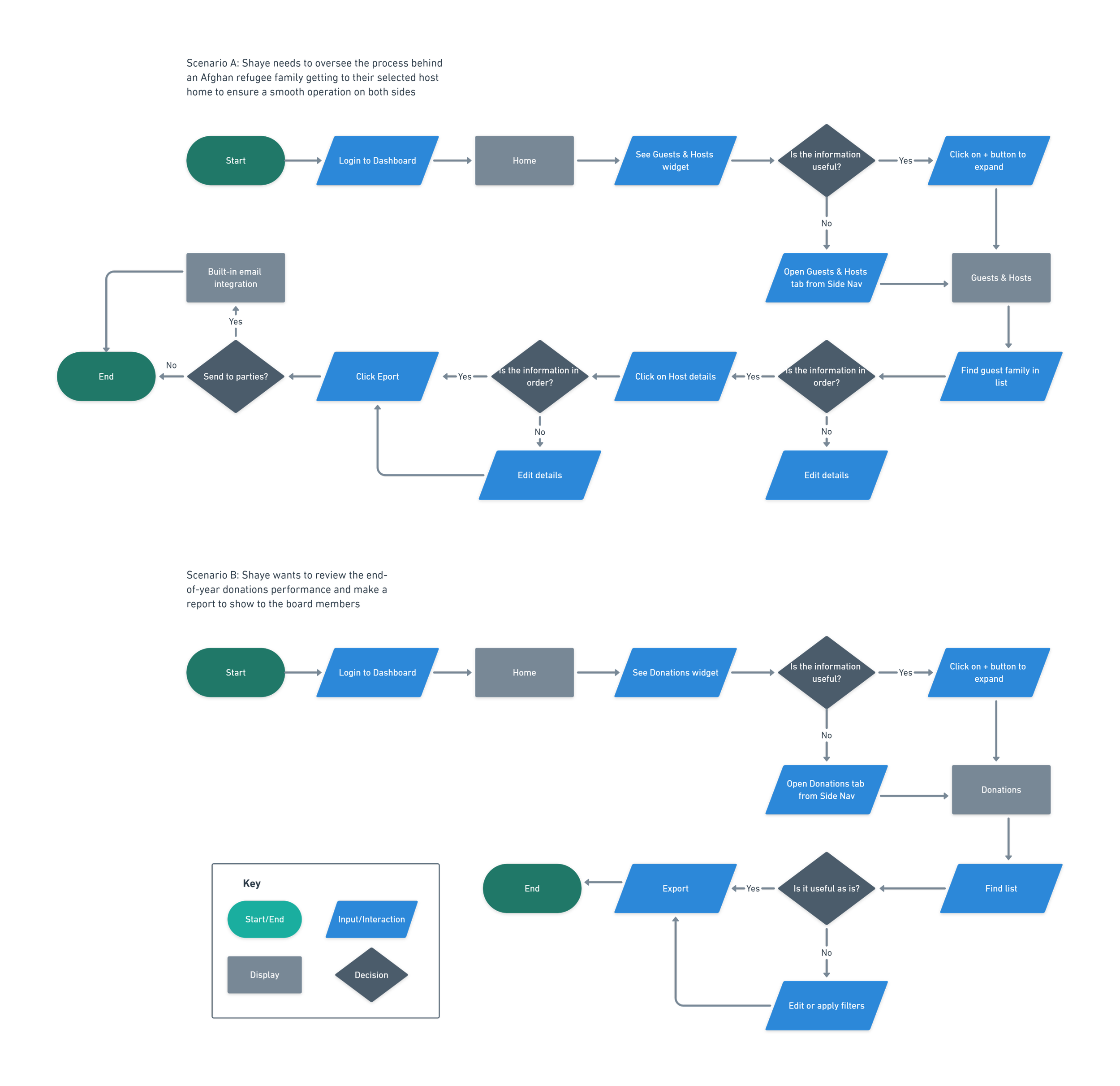
User Flow
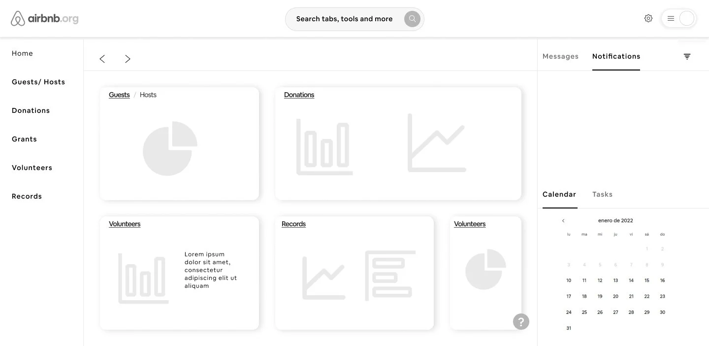
Wireframes
Mid-Fidelity
UI Kit
Prototype
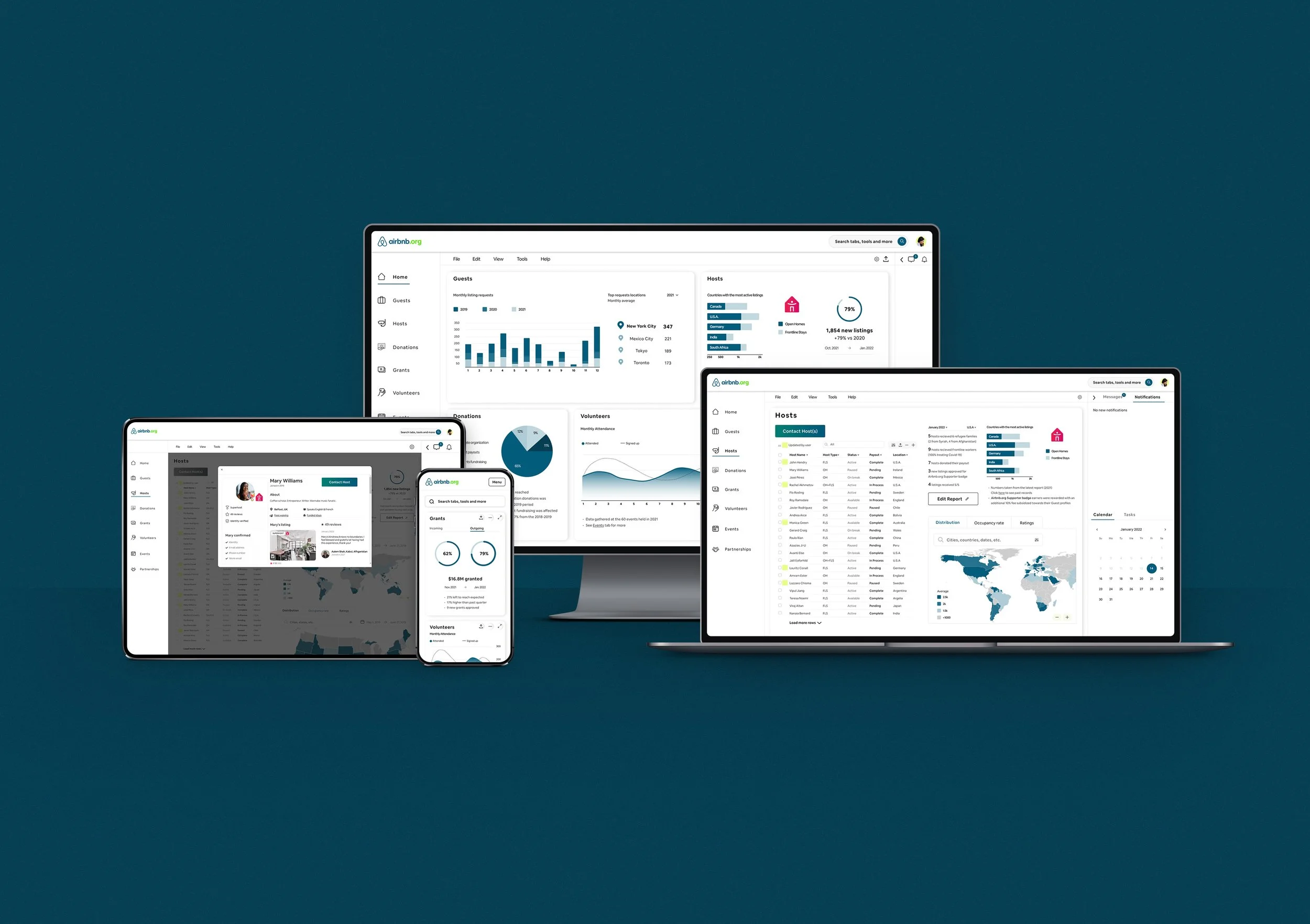
Responsive UI Designs
Usability Tests
A total of 5 participants performed the usability test using their own computers. All tests were conducted remotely, through screen-sharing with Zoom. Participants were between the ages of 24 and 47, 4 female, 1 male, tech savvy, and they all have experience with dashboards. 3 users work at a nonprofit, 1 designs dashboards, and 1 manages events and people.
They were each observed and recorded (with their previous consent) narrating their experience with each task, answering the scripted questions, and providing actionable feedback.
Results
Onboarding:
5/5 users responded well to having a first encounter with the prototype as a way of Onboarding experience.
Task completion:
90%. 5/5 users completed most of the tasks successfully and described the flows as easy/intuitive. The only task that wasn’t achieved on the first try was the “Re-size/Move Widgets”. This is attributed to the icons used (+) and their misrepresentation. Another example of this was the “Edit” icon, understood more as a “filter” icon. Despite this, all the participants commented on the dashboard’s learning curve and didn’t dwell on the icons too long.
Task route:
All the expected routes were used, affirming that it is better to prepare for all scenarios and cover all the bases instead of planning for a single route.
Revisions
The top priorities with the revisions were to provide clearer icons and increase the difference in colors’ accessibility.
Results
The main success metric achieved was the users’ delight and ease with the dashboard’s look and workings. The overall rating for their experience with the prototype was 9.3/10. Among the highlighted items were the dashboard’s visual cleanliness, ease of use, intuitive task flows, familiarity, thoroughness, and its resemblance to “real” dashboards.
Further testing with the applied revisions should be conducted to strive for improving marks, and a package applied to hand off to Engineering.
Neither Airbnb nor Airbnb.org were involved in this project. All information in this case study is my own and does not necessarily reflect the views of Airbnb.org.


