Chronos
Permeating a product’s uniqueness to the experience of browsing and booking it
With space tourism booming at the rate it is, imagining time travel suddenly doesn’t feel as sci-fi/far away as it did some years ago. And while it might just be another minute before it becomes a reality, envisioning how browsing and booking it might work amounts to an exercise in innovation where a unique product receives a unique digital experience.
Project summary
Chronos, a theoretical time travel company, wants to create a responsive website for its product. Their goal is to position themselves as a trustworthy business, and develop a branding identity and business strategy in line with their product’s uniqueness. Through the steps outlined below, a first approach was tested and iterated upon, with mostly positive reviews.
The Challenge
This project’s main challenge was also its biggest opportunity: that it addresses a product that doesn’t yet exist. While this means that there is nothing to compare it directly to, it also entails a creative freedom and rare chance to propose a truly unique and innovative digital experience that speaks to the very product’s nature.
Note: In order to determine a market and business model for this product, some assumptions had to be made and tested.
My Role
Supervised by my mentor, I carried out the Design Process steps described in this case study and performed as a UX/UI/IxD/Brand/Visual/Designer and User Researcher
Duration: 6 weeks
Tools: Figma, Optimal Workshop, Whimsical, Adobe Photoshop, Zoom
Empathize
In order to determine who this product is for/who to target it to, User Research was conducted to:
Analyze competing products (indirect or potential)
Gauge users’ reaction/thoughts to time travel as a serious/real business
Understand users’ processes when researching/booking travel, and find overlap/middle ground with time travel
Understand factors that create a good experience when booking travel
Competitive Analysis
Civilian space travel as the newest fad represents the biggest competition in terms of making something previously only reserved to astronauts, now accessible to the general population. Neuralink’s efforts to enhance brain interfaces and abilities through new technologies relate to Chronos’s business goal of pushing the boundaries of our own perception and life experience.
Enlarge 🔎 (New Tab)
User Research
The next challenge was observing physical travel booking patterns to gain enough insights to extrapolate into a time travel booking experience.
Thus, 5 participants were interviewed remotely (via Zoom) to find pain points and opportunities from which to determine the project’s characteristics.
Takeaways
Users feel that the researching and booking steps could be integrated into a single website: they see prices on one website but then go to another to book
Users expect the product delivery to be a mix between a serious website and a different/new experience
From a marketing perspective (1 participant’s expertise), the product could be offered in 3 options: the very expensive one (bespoke), the “normal” one (the most sought out, curated, pre-selected), and the expensive but achievable (travel in one’s own lifetime)
Science fiction was referenced by 4/5 participants and could be used as a tool to market the product
User Persona
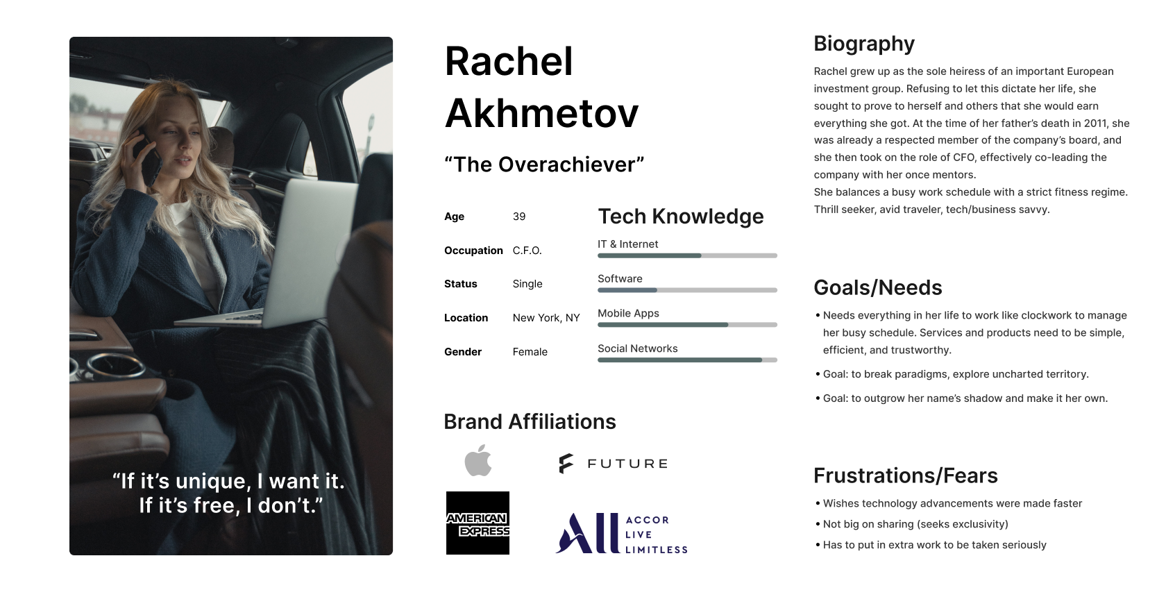
Translating the interviewees’ profiles/feedback and mixing them with findings from the competitive analysis’ users and customers, a primary persona was created to represent the prospective immediate product user.
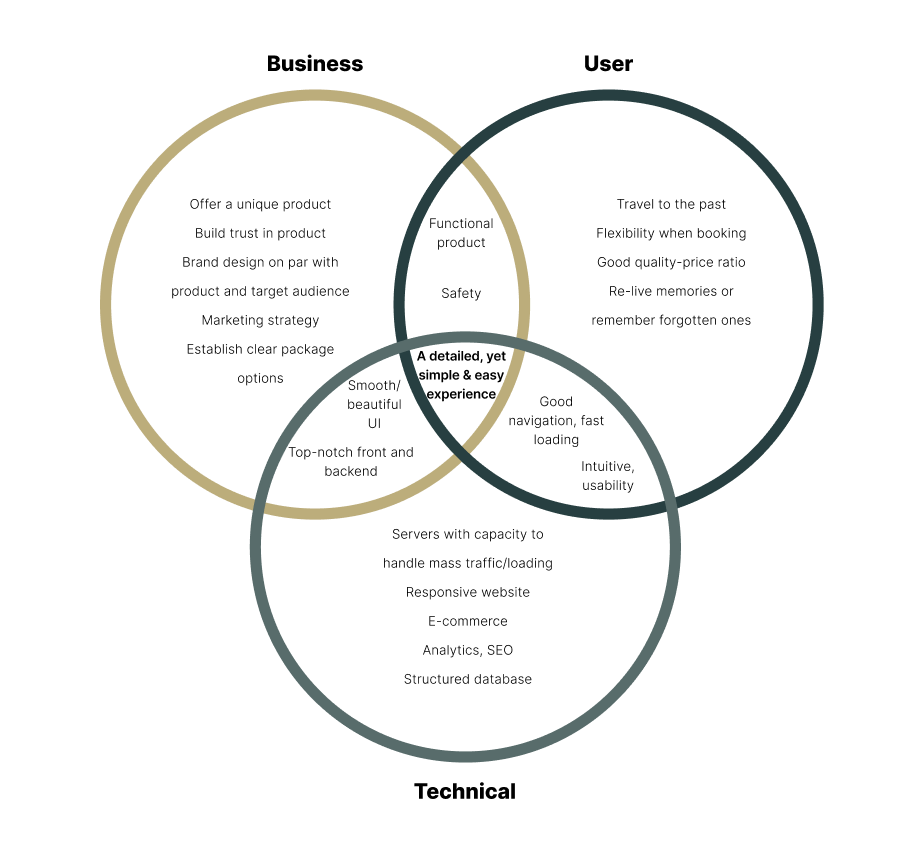
Project Goals
User Flow
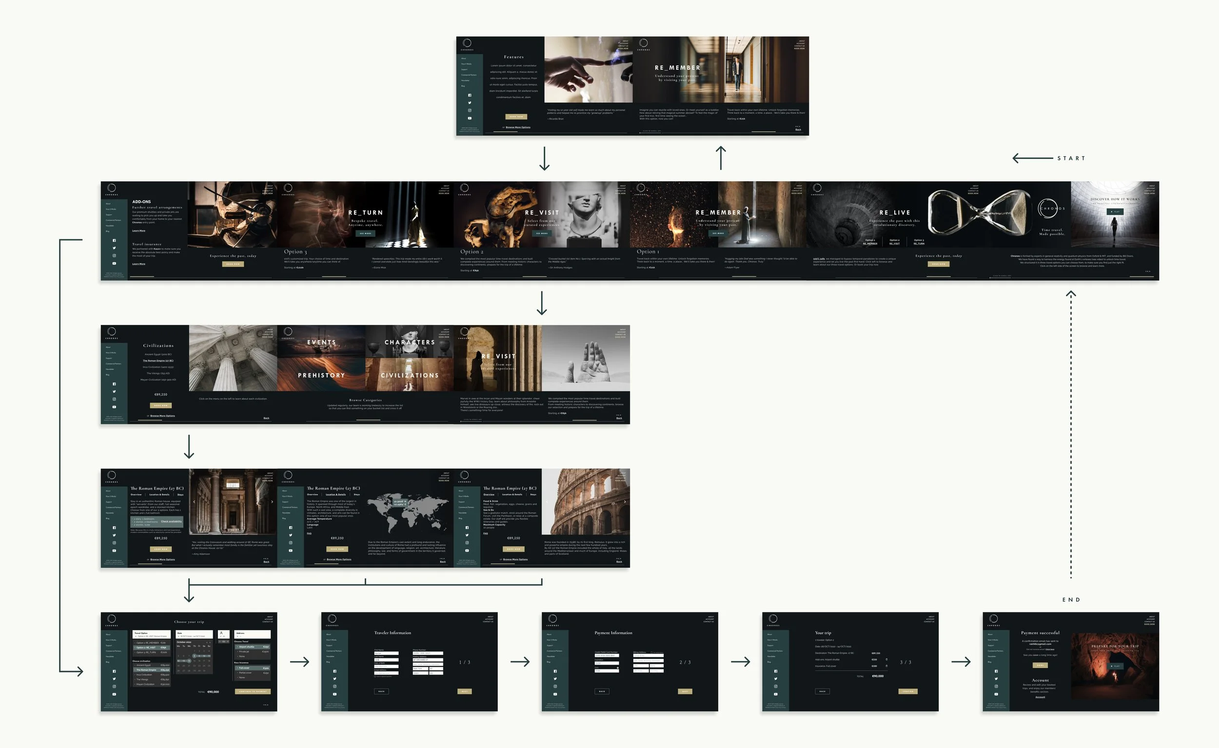
Next, how does the user navigate the site?
Enlarge 🔎
Card Sorting
For the second travel option, how does one determine how many categories to show, or how to group them? To do this, an open card sorting study was conducted.
The participants created a total of 36 categories, with a median of 4 categories each.
Categories
The cards’ content was chosen from the answers to the user interviews and from WatchData’s Probability Comparison: Top Time Travel Destinations video.
Said content, ranging from The Mesozoic Era to the Fall of the Berlin Wall, was then grouped into common themes with repeated or similar titles. The most common categories were then used verbatim as the 4 (because it was the study’s median number) options from which to choose a “curated experience”: Events, Characters, Prehistory, and Civilizations.
Wireframes
Drawing a lot of inspiration from the websites analyzed in the Competitive Research, initial Lo-Fi wireframes displayed an intention of having a very visual/image-heavy booking website, to be as impactful and memorable as the product itself.
Turning Point
The above wireframes worked fine, and could’ve made for a website that met all the Project Goals. However, to create a unique and coherent discourse between the product (traveling BACK in time) and its delivery, a leftward horizontal scroll (reference) was then proposed and carried out for the website’s navigation.
Enlarge 🔎
Brand Name & Logo
The working title for the project was RE_, as the stylized static element in the product’s options: REmember, RElive, REvisit.
However, by itself, it didn’t quite have the impact that the product required, so other options (inspired by the product’s theme and the analyzed competing companies’ names) were explored: Anachronix, Levart (Travel spelled backwards, consistent with the leftward navigation), Encore, Chronos, and Aeternitas.
Informal user testing, resulted in Chronos as the option with the most impact and memorability.
Name: Chronos (/ˈkroʊnɒs/; Greek: Χρόνος, [kʰrónos] (Modern Greek: [ˈxronos]); Meaning - "time"), is the personification of time in pre-Socratic philosophy and later literature.
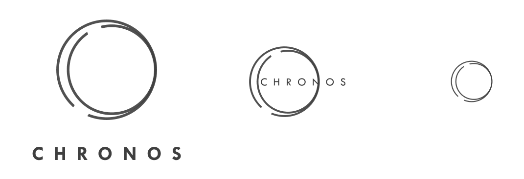
Logo: Geometric abstraction of product, hinting at a letter C. Wordmark in sans-serif font for optimal readability.
The circle represents time travel’s looping nature. Its duplication mimics the product’s workings. The apertures and convergences represent points of entry and repetition, respectively. It can be displayed in 3 sizes:
UI Kit
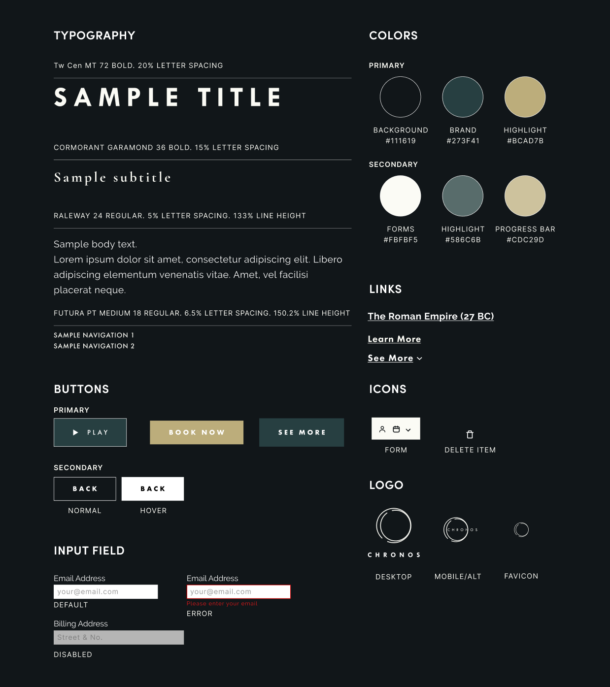
A graphic recollection of all the elements used throughout the design.
Prototype
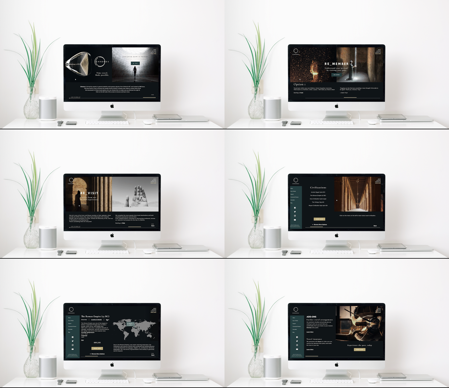
Hi-Fidelity screens were produced from the wireframes, and interactions between them resulted in the prototype that would be tested next.
The biggest challenge in this step was configuring the leftward “scrolling”. Dragging the screen to the side resembled scrolling more closely than clicking, but there was no way for me to configure stops to differentiate one screen from the next when dragging. This resulted in choosing a click as a trigger for the prototype to “scroll” sideways.
Responsive UI Designs
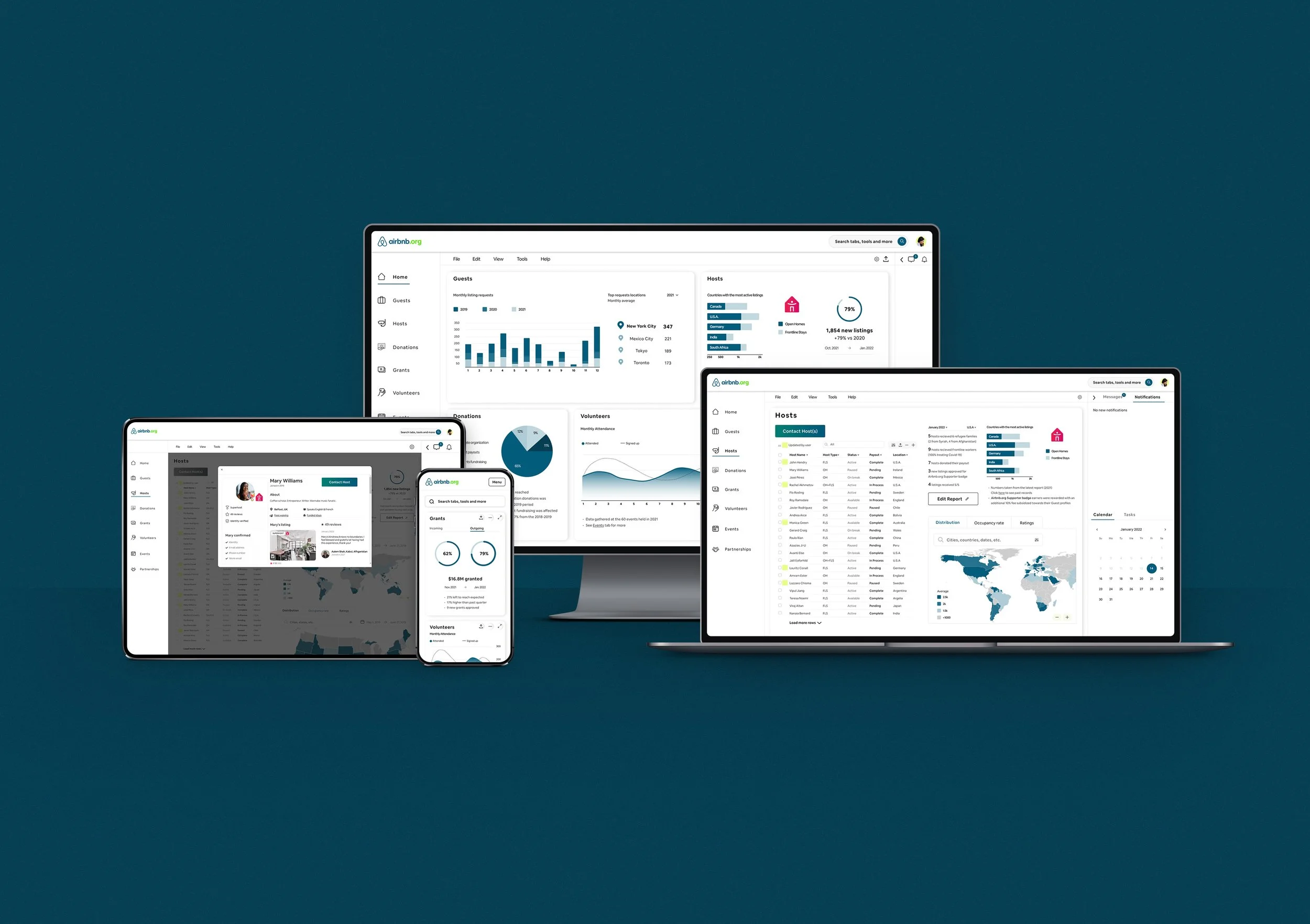
As a part of the project’s scope, the screens were mocked up to show the site’s responsiveness and device adaptability.
Usability Tests & Affinity Map
5 participants performed the usability test using their own computers. 1 test was conducted in person and 4 were conducted remotely. Participants were between the ages of 28 and 34, 2 female, 3 male, tech savvy, and travel often. 1 user aligns closely with the persona.
They were each observed and recorded (with their previous consent) narrating their experience with each task, answering the scripted questions, and providing actionable feedback.
Results
Navigation:
5/5 users’ first instinct was to scroll naturally
2/5 expressed dislike towards clicking to scroll
1/5 wondered about scrolling instead of clicking
5/5 users struggled to navigate at first, but managed (and most liked) just fine afterwards
Task completion:
100%. 5/5 users completed the tasks successfully and described the booking/checking out as easy
Task route:
When asked to book a trip,
3/5 users used the button on the second screen. 2 expressed a need for a shorter path
2/5 users booked through the Option page (RE_Visit)


